ENTERVIA
We created a flexible, scalable brand identity for Entervia, a live sessions and community management platform, reflecting its digital product.
WE UNITED THE BRAND AROUND ONE IDEA.
Entervia is a digital platform that helps experts, educators and community leaders plan live sessions, deliver them and turn their knowledge into a sustainable business model. Our task was to move beyond listing product features and make the transformation offered by the brand visible. The supplied creative work shows the real applications of this world, from the logo, colour and typography systems to the website interface, social content and event communication.
01 — Understanding the product
We began this stage by bringing connected functions such as live sessions, payments, scheduling and community management into one simple whole. We reviewed the existing material, product reality, audience questions and the moments where information could become unclear. Workshops and content mapping helped the team separate assumptions from evidence. That shared view gave strategy, design and production teams one reference point, so decisions could be explained and repeated rather than depending on personal preference. We also considered how this part of the experience would behave on a small phone, a wide presentation screen, a social post and a live conversation.
We responded with a clear decision: building a product narrative that explained technical functions through everyday user goals. The decision was translated into copy principles, reusable layouts, production notes and review criteria. Each output had to make the next action obvious, preserve the character of the brand and remain useful when content changed. We tested the logic against common user questions and realistic production pressure. This made the work more than a polished presentation: it became an operational tool that supported consistent choices, reduced repeated effort and gave the team room to develop new communication without losing the central idea.
02 — Mapping the journey
The central question at this point was how to approach recognising that experts, participants and organisations arrive with different expectations. We reviewed the existing material, product reality, audience questions and the moments where information could become unclear. Workshops and content mapping helped the team separate assumptions from evidence. That shared view gave strategy, design and production teams one reference point, so decisions could be explained and repeated rather than depending on personal preference. We also considered how this part of the experience would behave on a small phone, a wide presentation screen, a social post and a live conversation.
The review clarified our direction: drawing a clear route for every role from discovery and registration to the post-session experience. The decision was translated into copy principles, reusable layouts, production notes and review criteria. Each output had to make the next action obvious, preserve the character of the brand and remain useful when content changed. We tested the logic against common user questions and realistic production pressure. This made the work more than a polished presentation: it became an operational tool that supported consistent choices, reduced repeated effort and gave the team room to develop new communication without losing the central idea.
03 — Defining the promise
As the work developed, we concentrated on connecting knowledge sharing, meaningful relationships and sustainable growth in one statement. We reviewed the existing material, product reality, audience questions and the moments where information could become unclear. Workshops and content mapping helped the team separate assumptions from evidence. That shared view gave strategy, design and production teams one reference point, so decisions could be explained and repeated rather than depending on personal preference. We also considered how this part of the experience would behave on a small phone, a wide presentation screen, a social post and a live conversation.
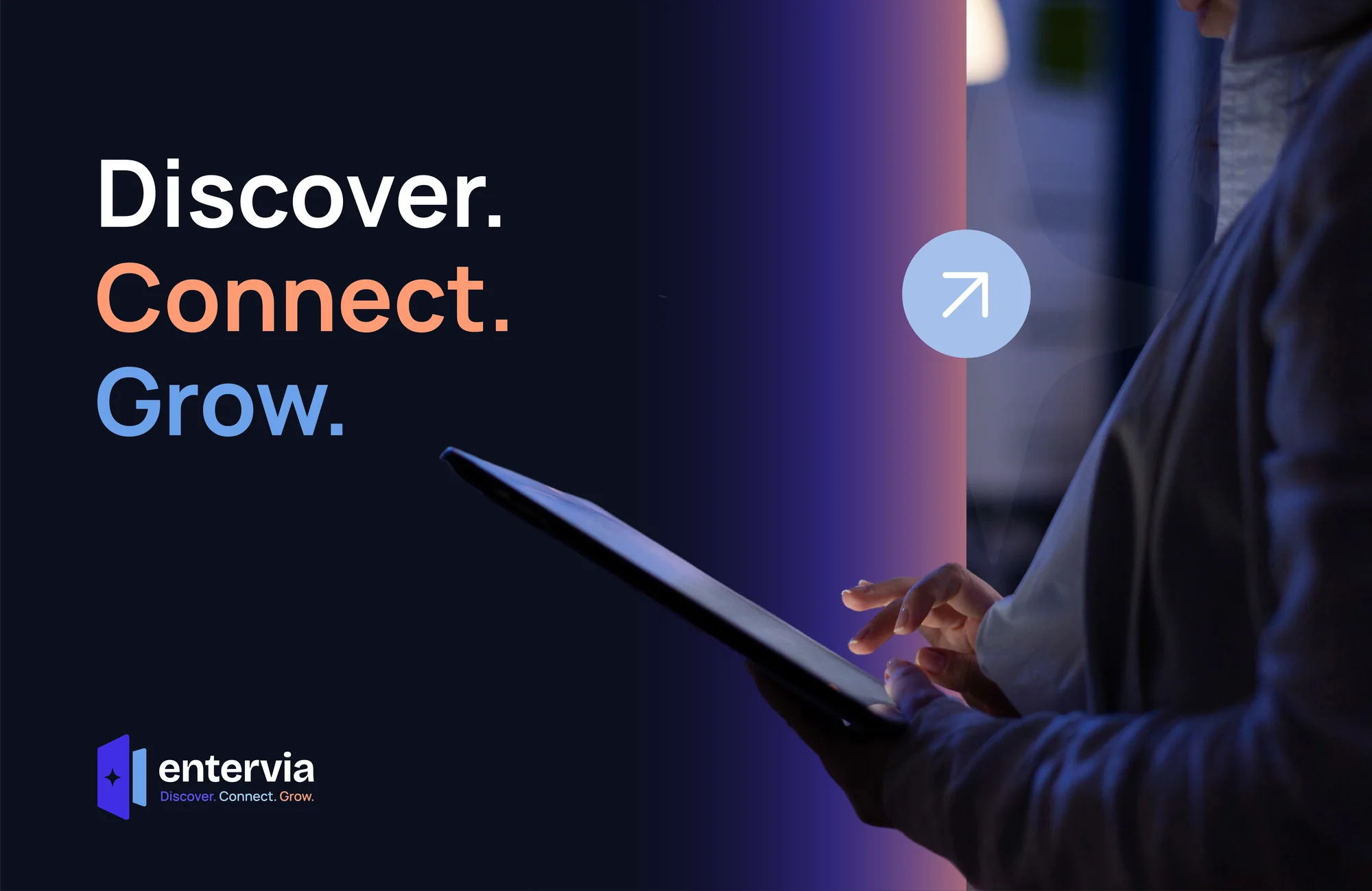
This thinking shaped the next move: placing the Discover, Connect, Grow idea at the centre of brand behaviour. The decision was translated into copy principles, reusable layouts, production notes and review criteria. Each output had to make the next action obvious, preserve the character of the brand and remain useful when content changed. We tested the logic against common user questions and realistic production pressure. This made the work more than a polished presentation: it became an operational tool that supported consistent choices, reduced repeated effort and gave the team room to develop new communication without losing the central idea.
04 — Name and symbol
The next priority was combining the feelings of entry, meeting and forward movement in a digital mark. We reviewed the existing material, product reality, audience questions and the moments where information could become unclear. Workshops and content mapping helped the team separate assumptions from evidence. That shared view gave strategy, design and production teams one reference point, so decisions could be explained and repeated rather than depending on personal preference. We also considered how this part of the experience would behave on a small phone, a wide presentation screen, a social post and a live conversation.
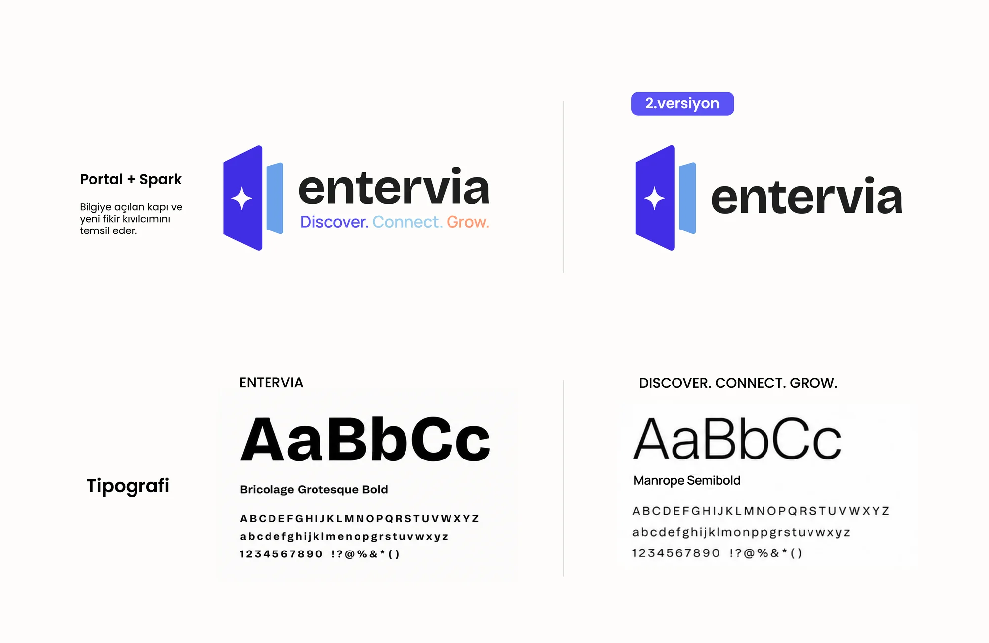
In practice, the response centred on developing a modular symbol inspired by a doorway and direction that remained clear at every size. The decision was translated into copy principles, reusable layouts, production notes and review criteria. Each output had to make the next action obvious, preserve the character of the brand and remain useful when content changed. We tested the logic against common user questions and realistic production pressure. This made the work more than a polished presentation: it became an operational tool that supported consistent choices, reduced repeated effort and gave the team room to develop new communication without losing the central idea.
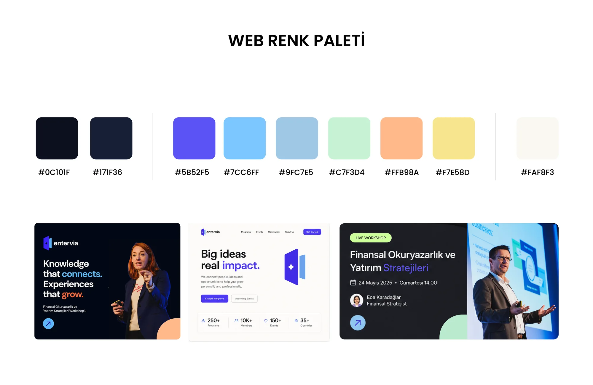
05 — Colour system
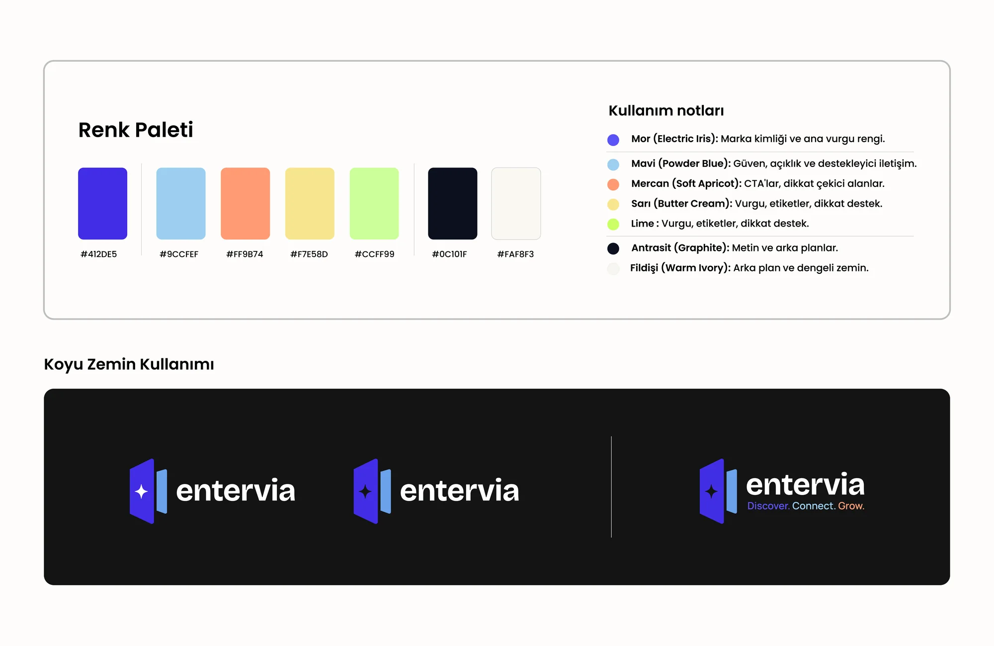
For Colour system, our aim was balancing confidence in technology with an energetic and human personality. We reviewed the existing material, product reality, audience questions and the moments where information could become unclear. Workshops and content mapping helped the team separate assumptions from evidence. That shared view gave strategy, design and production teams one reference point, so decisions could be explained and repeated rather than depending on personal preference. We also considered how this part of the experience would behave on a small phone, a wide presentation screen, a social post and a live conversation.
Our chosen approach involved expanding the purple and blue foundation through warm accents in an accessible palette. The decision was translated into copy principles, reusable layouts, production notes and review criteria. Each output had to make the next action obvious, preserve the character of the brand and remain useful when content changed. We tested the logic against common user questions and realistic production pressure. This made the work more than a polished presentation: it became an operational tool that supported consistent choices, reduced repeated effort and gave the team room to develop new communication without losing the central idea.
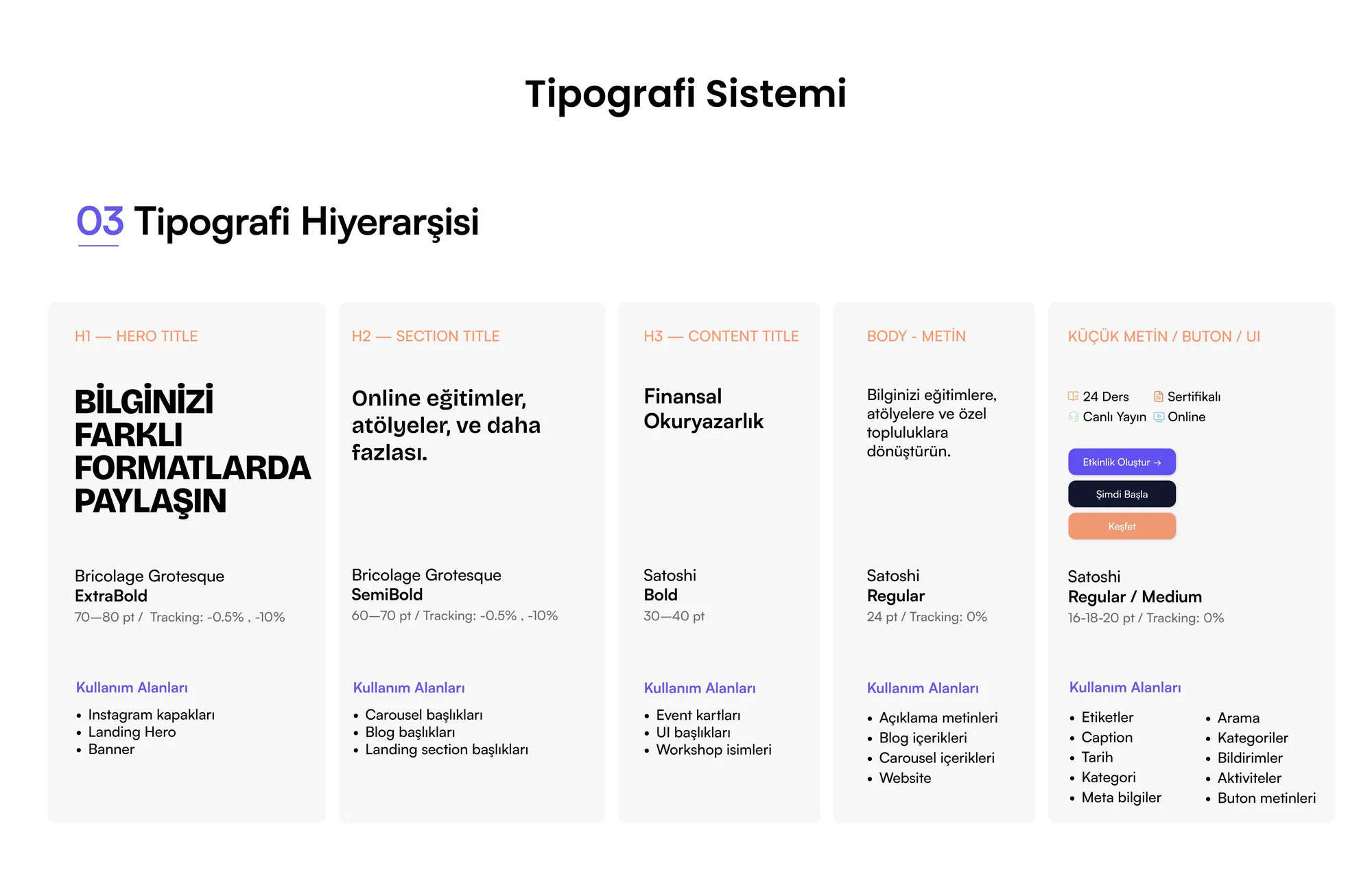
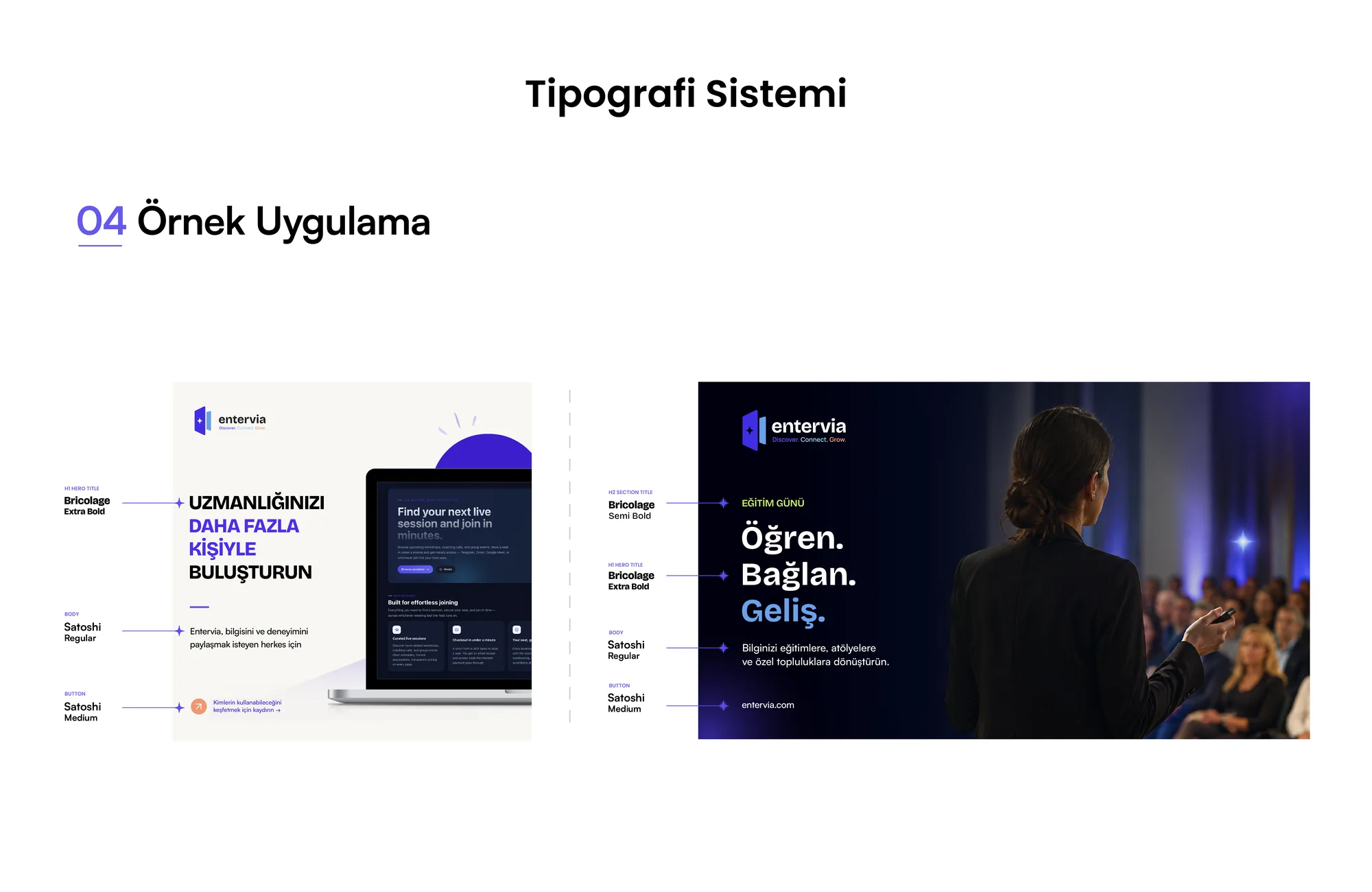
06 — Typography
We began this stage by creating clarity in product screens while giving campaigns a strong voice. We reviewed the existing material, product reality, audience questions and the moments where information could become unclear. Workshops and content mapping helped the team separate assumptions from evidence. That shared view gave strategy, design and production teams one reference point, so decisions could be explained and repeated rather than depending on personal preference. We also considered how this part of the experience would behave on a small phone, a wide presentation screen, a social post and a live conversation.
We responded with a clear decision: selecting complementary type families for readability, hierarchy and flexible composition. The decision was translated into copy principles, reusable layouts, production notes and review criteria. Each output had to make the next action obvious, preserve the character of the brand and remain useful when content changed. We tested the logic against common user questions and realistic production pressure. This made the work more than a polished presentation: it became an operational tool that supported consistent choices, reduced repeated effort and gave the team room to develop new communication without losing the central idea.
07 — Website experience
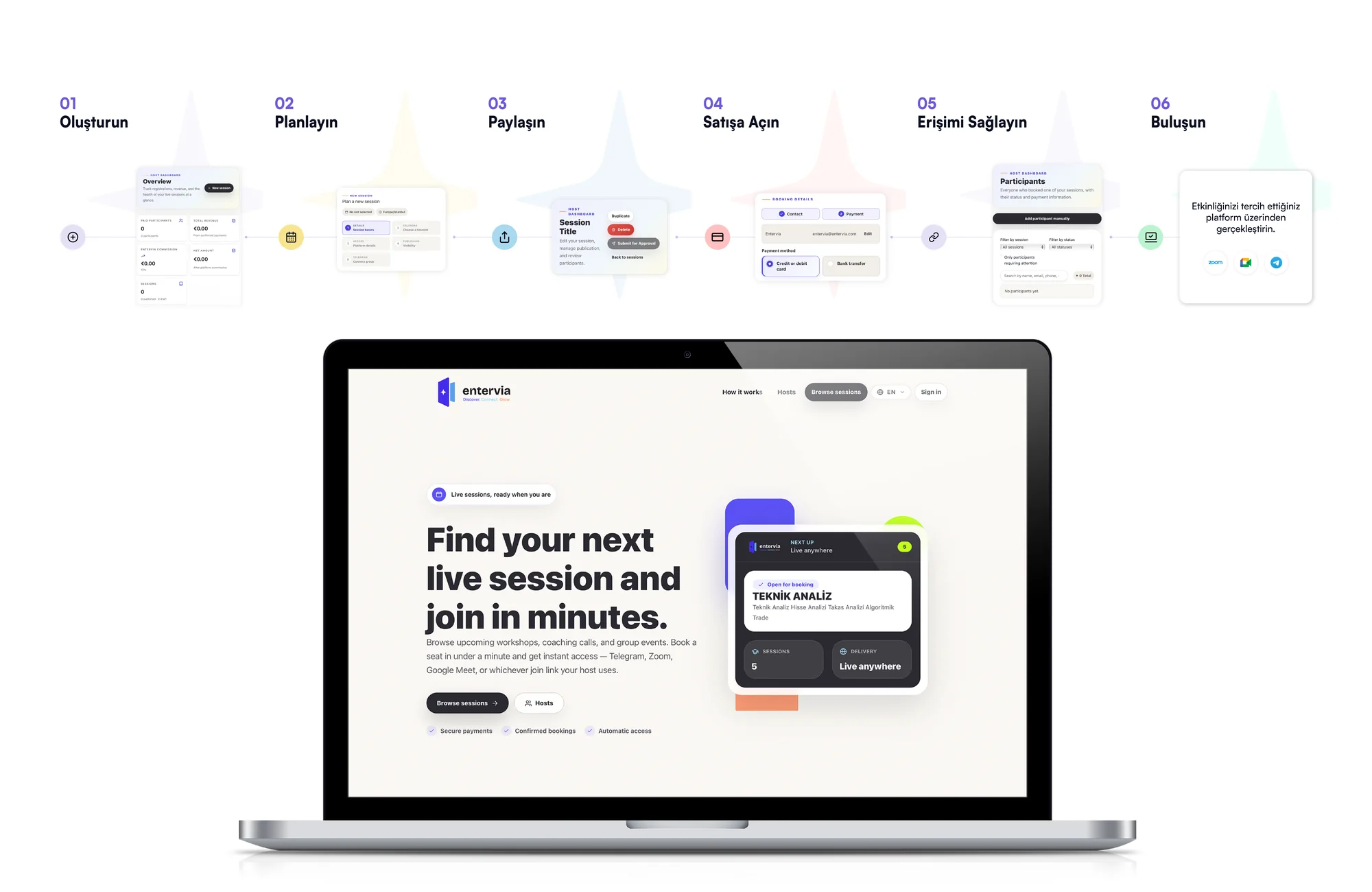
The central question at this point was how to approach explaining the platform benefit immediately and guiding visitors toward the right action. We reviewed the existing material, product reality, audience questions and the moments where information could become unclear. Workshops and content mapping helped the team separate assumptions from evidence. That shared view gave strategy, design and production teams one reference point, so decisions could be explained and repeated rather than depending on personal preference. We also considered how this part of the experience would behave on a small phone, a wide presentation screen, a social post and a live conversation.
The review clarified our direction: ordering value, use cases and registration steps through a clear information architecture. The decision was translated into copy principles, reusable layouts, production notes and review criteria. Each output had to make the next action obvious, preserve the character of the brand and remain useful when content changed. We tested the logic against common user questions and realistic production pressure. This made the work more than a polished presentation: it became an operational tool that supported consistent choices, reduced repeated effort and gave the team room to develop new communication without losing the central idea.
08 — Explaining features
As the work developed, we concentrated on preventing the number of capabilities from creating cognitive load. We reviewed the existing material, product reality, audience questions and the moments where information could become unclear. Workshops and content mapping helped the team separate assumptions from evidence. That shared view gave strategy, design and production teams one reference point, so decisions could be explained and repeated rather than depending on personal preference. We also considered how this part of the experience would behave on a small phone, a wide presentation screen, a social post and a live conversation.
This thinking shaped the next move: presenting features as scenarios connected to real ambitions instead of a list of tools. The decision was translated into copy principles, reusable layouts, production notes and review criteria. Each output had to make the next action obvious, preserve the character of the brand and remain useful when content changed. We tested the logic against common user questions and realistic production pressure. This made the work more than a polished presentation: it became an operational tool that supported consistent choices, reduced repeated effort and gave the team room to develop new communication without losing the central idea.
09 — Social communication
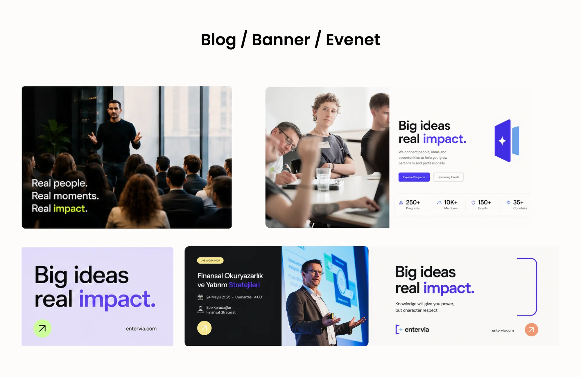
The next priority was making expertise and community energy consistently visible. We reviewed the existing material, product reality, audience questions and the moments where information could become unclear. Workshops and content mapping helped the team separate assumptions from evidence. That shared view gave strategy, design and production teams one reference point, so decisions could be explained and repeated rather than depending on personal preference. We also considered how this part of the experience would behave on a small phone, a wide presentation screen, a social post and a live conversation.
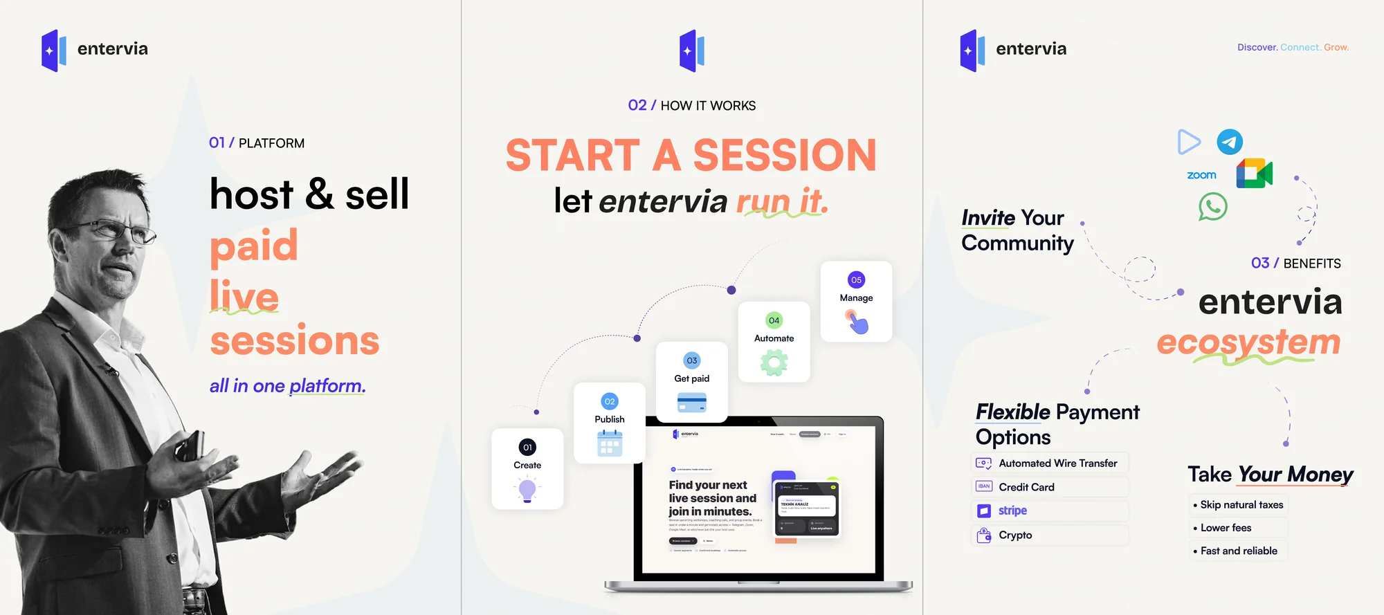
In practice, the response centred on combining educational, inspirational, product and event content through modular templates. The decision was translated into copy principles, reusable layouts, production notes and review criteria. Each output had to make the next action obvious, preserve the character of the brand and remain useful when content changed. We tested the logic against common user questions and realistic production pressure. This made the work more than a polished presentation: it became an operational tool that supported consistent choices, reduced repeated effort and gave the team room to develop new communication without losing the central idea.
10 — Event communication
For Event communication, our aim was protecting the same character across online and physical meetings. We reviewed the existing material, product reality, audience questions and the moments where information could become unclear. Workshops and content mapping helped the team separate assumptions from evidence. That shared view gave strategy, design and production teams one reference point, so decisions could be explained and repeated rather than depending on personal preference. We also considered how this part of the experience would behave on a small phone, a wide presentation screen, a social post and a live conversation.
Our chosen approach involved building a rapidly adaptable kit for speakers, sessions, reminders and outcome content. The decision was translated into copy principles, reusable layouts, production notes and review criteria. Each output had to make the next action obvious, preserve the character of the brand and remain useful when content changed. We tested the logic against common user questions and realistic production pressure. This made the work more than a polished presentation: it became an operational tool that supported consistent choices, reduced repeated effort and gave the team room to develop new communication without losing the central idea.
11 — Design system
We began this stage by helping different teams produce work without fragmenting the brand. We reviewed the existing material, product reality, audience questions and the moments where information could become unclear. Workshops and content mapping helped the team separate assumptions from evidence. That shared view gave strategy, design and production teams one reference point, so decisions could be explained and repeated rather than depending on personal preference. We also considered how this part of the experience would behave on a small phone, a wide presentation screen, a social post and a live conversation.
We responded with a clear decision: collecting component, spacing, icon, photography and tone rules in a shared library. The decision was translated into copy principles, reusable layouts, production notes and review criteria. Each output had to make the next action obvious, preserve the character of the brand and remain useful when content changed. We tested the logic against common user questions and realistic production pressure. This made the work more than a polished presentation: it became an operational tool that supported consistent choices, reduced repeated effort and gave the team room to develop new communication without losing the central idea.
12 — Trust and accessibility
The central question at this point was how to approach reducing hesitation around payment and live participation decisions. We reviewed the existing material, product reality, audience questions and the moments where information could become unclear. Workshops and content mapping helped the team separate assumptions from evidence. That shared view gave strategy, design and production teams one reference point, so decisions could be explained and repeated rather than depending on personal preference. We also considered how this part of the experience would behave on a small phone, a wide presentation screen, a social post and a live conversation.
The review clarified our direction: giving users control through clear microcopy, visible states and strong contrast. The decision was translated into copy principles, reusable layouts, production notes and review criteria. Each output had to make the next action obvious, preserve the character of the brand and remain useful when content changed. We tested the logic against common user questions and realistic production pressure. This made the work more than a polished presentation: it became an operational tool that supported consistent choices, reduced repeated effort and gave the team room to develop new communication without losing the central idea.
13 — Preparing for scale
As the work developed, we concentrated on protecting identity as new markets and use cases are introduced. We reviewed the existing material, product reality, audience questions and the moments where information could become unclear. Workshops and content mapping helped the team separate assumptions from evidence. That shared view gave strategy, design and production teams one reference point, so decisions could be explained and repeated rather than depending on personal preference. We also considered how this part of the experience would behave on a small phone, a wide presentation screen, a social post and a live conversation.
This thinking shaped the next move: leaving a flexible brand architecture that adapts to changes in language, format and channel. The decision was translated into copy principles, reusable layouts, production notes and review criteria. Each output had to make the next action obvious, preserve the character of the brand and remain useful when content changed. We tested the logic against common user questions and realistic production pressure. This made the work more than a polished presentation: it became an operational tool that supported consistent choices, reduced repeated effort and gave the team room to develop new communication without losing the central idea.
A connected outcome
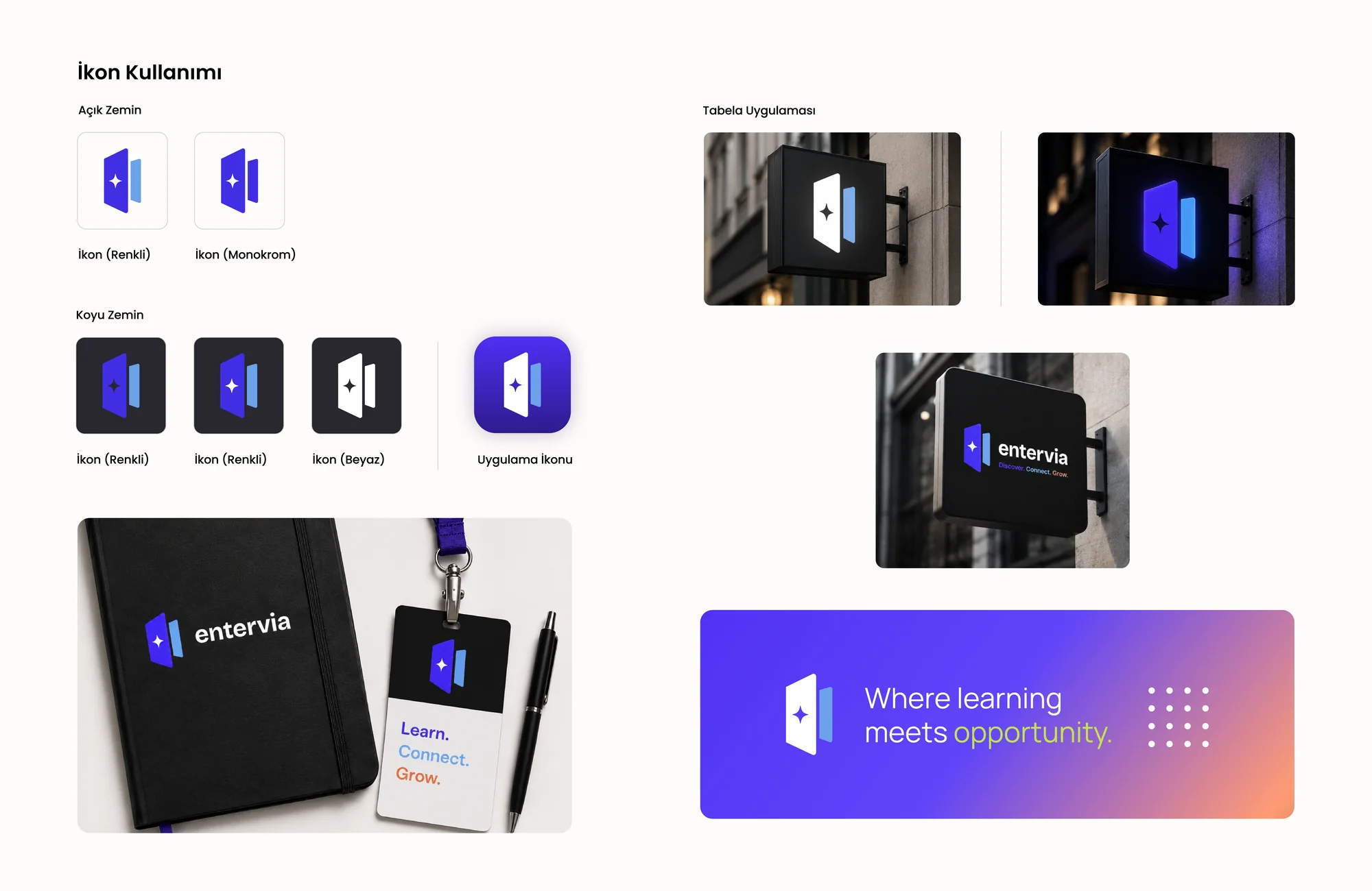
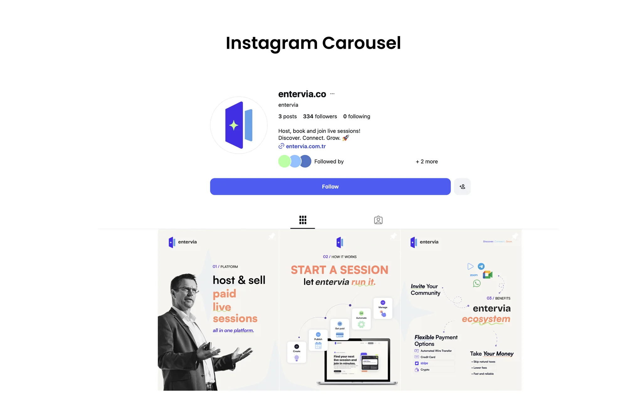
The Entervia system removed the boundary between product interface and brand communication. Users can experience the same clarity in the registration flow, a live session and social content that they first encounter on the website. The supplied guidelines, web screens, carousel examples and applications show how this continuity works at different scales. The result is a technology-led yet human brand, confident yet approachable, and ready to grow without losing its character.
WHAT DID WE NEED TO SOLVE?
Build a flexible system that explains live sessions, payments and community management to different user groups while turning Entervia’s innovative product into a trustworthy and accessible brand experience.
HOW DID WE BUILD THE SYSTEM?
We shaped Entervia’s brand strategy around the product’s uses and audiences. A modular design system for its visual identity, social media content, corporate presentations and product interface helps the brand communicate consistently across digital touchpoints.
MORE THAN DELIVERABLES: A REUSABLE SYSTEM.
THE SYSTEM ACROSS DIFFERENT TOUCHPOINTS.