Startup World Cup Türkiye
We built a cohesive brand communications system for Startup World Cup Türkiye, spanning digital channels and the event venue.
WE UNITED THE BRAND AROUND ONE IDEA.
Startup World Cup Türkiye is a layered experience that brings the speed of entrepreneurship together with the energy of a live final. This case study explains how we connected communication from the first application call to the Türkiye final through one clear brand idea. The aim went beyond producing striking visuals. We needed a system that founders, investors, judges, speakers and visitors could follow easily, while giving the organising team dependable tools for a demanding and constantly changing schedule.
01 — Reading the context
We began this stage by bringing the prestige of a global competition together with the energy of the Turkish startup ecosystem. We reviewed the existing material, product reality, audience questions and the moments where information could become unclear. Workshops and content mapping helped the team separate assumptions from evidence. That shared view gave strategy, design and production teams one reference point, so decisions could be explained and repeated rather than depending on personal preference. We also considered how this part of the experience would behave on a small phone, a wide presentation screen, a social post and a live conversation.
We responded with a clear decision: building a locally relevant voice that still felt confident on an international stage. The decision was translated into copy principles, reusable layouts, production notes and review criteria. Each output had to make the next action obvious, preserve the character of the brand and remain useful when content changed. We tested the logic against common user questions and realistic production pressure. This made the work more than a polished presentation: it became an operational tool that supported consistent choices, reduced repeated effort and gave the team room to develop new communication without losing the central idea.
02 — Mapping audiences
The central question at this point was how to approach understanding the different information needs of founders, investors, judges, speakers, partners and visitors. We reviewed the existing material, product reality, audience questions and the moments where information could become unclear. Workshops and content mapping helped the team separate assumptions from evidence. That shared view gave strategy, design and production teams one reference point, so decisions could be explained and repeated rather than depending on personal preference. We also considered how this part of the experience would behave on a small phone, a wide presentation screen, a social post and a live conversation.
The review clarified our direction: creating a communication sequence that delivered the right message to each group at the right moment. The decision was translated into copy principles, reusable layouts, production notes and review criteria. Each output had to make the next action obvious, preserve the character of the brand and remain useful when content changed. We tested the logic against common user questions and realistic production pressure. This made the work more than a polished presentation: it became an operational tool that supported consistent choices, reduced repeated effort and gave the team room to develop new communication without losing the central idea.
03 — Defining the idea
As the work developed, we concentrated on balancing the pressure of competition with opportunities for progress, connection and visibility. We reviewed the existing material, product reality, audience questions and the moments where information could become unclear. Workshops and content mapping helped the team separate assumptions from evidence. That shared view gave strategy, design and production teams one reference point, so decisions could be explained and repeated rather than depending on personal preference. We also considered how this part of the experience would behave on a small phone, a wide presentation screen, a social post and a live conversation.
This thinking shaped the next move: presenting the programme as a long founder journey instead of a single final night. The decision was translated into copy principles, reusable layouts, production notes and review criteria. Each output had to make the next action obvious, preserve the character of the brand and remain useful when content changed. We tested the logic against common user questions and realistic production pressure. This made the work more than a polished presentation: it became an operational tool that supported consistent choices, reduced repeated effort and gave the team room to develop new communication without losing the central idea.
04 — Building the visual system
The next priority was developing a flexible design language that could support fast production without losing consistency. We reviewed the existing material, product reality, audience questions and the moments where information could become unclear. Workshops and content mapping helped the team separate assumptions from evidence. That shared view gave strategy, design and production teams one reference point, so decisions could be explained and repeated rather than depending on personal preference. We also considered how this part of the experience would behave on a small phone, a wide presentation screen, a social post and a live conversation.
In practice, the response centred on turning typography, colour, motion and information hierarchy into reusable rules. The decision was translated into copy principles, reusable layouts, production notes and review criteria. Each output had to make the next action obvious, preserve the character of the brand and remain useful when content changed. We tested the logic against common user questions and realistic production pressure. This made the work more than a polished presentation: it became an operational tool that supported consistent choices, reduced repeated effort and gave the team room to develop new communication without losing the central idea.
05 — Application period
For Application period, our aim was making detailed calls for entry clear, motivating and easy to share. We reviewed the existing material, product reality, audience questions and the moments where information could become unclear. Workshops and content mapping helped the team separate assumptions from evidence. That shared view gave strategy, design and production teams one reference point, so decisions could be explained and repeated rather than depending on personal preference. We also considered how this part of the experience would behave on a small phone, a wide presentation screen, a social post and a live conversation.
Our chosen approach involved giving deadlines, requirements and value propositions the same priority across formats. The decision was translated into copy principles, reusable layouts, production notes and review criteria. Each output had to make the next action obvious, preserve the character of the brand and remain useful when content changed. We tested the logic against common user questions and realistic production pressure. This made the work more than a polished presentation: it became an operational tool that supported consistent choices, reduced repeated effort and gave the team room to develop new communication without losing the central idea.
06 — Finalist communication
We began this stage by giving every startup space for its own story while keeping the event brand visible. We reviewed the existing material, product reality, audience questions and the moments where information could become unclear. Workshops and content mapping helped the team separate assumptions from evidence. That shared view gave strategy, design and production teams one reference point, so decisions could be explained and repeated rather than depending on personal preference. We also considered how this part of the experience would behave on a small phone, a wide presentation screen, a social post and a live conversation.
We responded with a clear decision: creating modular finalist cards and content series for a consistent publishing rhythm. The decision was translated into copy principles, reusable layouts, production notes and review criteria. Each output had to make the next action obvious, preserve the character of the brand and remain useful when content changed. We tested the logic against common user questions and realistic production pressure. This made the work more than a polished presentation: it became an operational tool that supported consistent choices, reduced repeated effort and gave the team room to develop new communication without losing the central idea.
07 — Social media system
The central question at this point was how to approach managing announcements, learning content, reminders and live-day updates in one rhythm. We reviewed the existing material, product reality, audience questions and the moments where information could become unclear. Workshops and content mapping helped the team separate assumptions from evidence. That shared view gave strategy, design and production teams one reference point, so decisions could be explained and repeated rather than depending on personal preference. We also considered how this part of the experience would behave on a small phone, a wide presentation screen, a social post and a live conversation.
The review clarified our direction: preparing templates and publishing principles that the team could adapt to schedule changes. The decision was translated into copy principles, reusable layouts, production notes and review criteria. Each output had to make the next action obvious, preserve the character of the brand and remain useful when content changed. We tested the logic against common user questions and realistic production pressure. This made the work more than a polished presentation: it became an operational tool that supported consistent choices, reduced repeated effort and gave the team room to develop new communication without losing the central idea.
08 — Stage experience
As the work developed, we concentrated on continuing the digital narrative without interruption inside the physical venue. We reviewed the existing material, product reality, audience questions and the moments where information could become unclear. Workshops and content mapping helped the team separate assumptions from evidence. That shared view gave strategy, design and production teams one reference point, so decisions could be explained and repeated rather than depending on personal preference. We also considered how this part of the experience would behave on a small phone, a wide presentation screen, a social post and a live conversation.
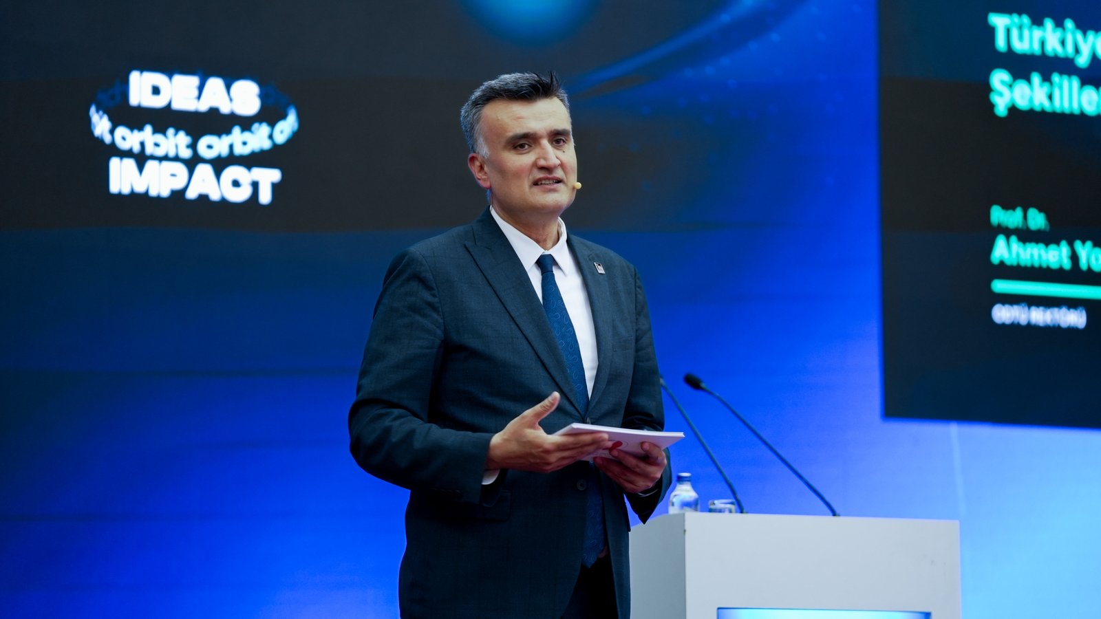
This thinking shaped the next move: designing stage screens, speaker cards and transitions through the same visual language. The decision was translated into copy principles, reusable layouts, production notes and review criteria. Each output had to make the next action obvious, preserve the character of the brand and remain useful when content changed. We tested the logic against common user questions and realistic production pressure. This made the work more than a polished presentation: it became an operational tool that supported consistent choices, reduced repeated effort and gave the team room to develop new communication without losing the central idea.
09 — Venue navigation
The next priority was making essential information easy to find during heavy visitor traffic. We reviewed the existing material, product reality, audience questions and the moments where information could become unclear. Workshops and content mapping helped the team separate assumptions from evidence. That shared view gave strategy, design and production teams one reference point, so decisions could be explained and repeated rather than depending on personal preference. We also considered how this part of the experience would behave on a small phone, a wide presentation screen, a social post and a live conversation.
In practice, the response centred on connecting registration, halls, schedules and partner zones through a clear wayfinding hierarchy. The decision was translated into copy principles, reusable layouts, production notes and review criteria. Each output had to make the next action obvious, preserve the character of the brand and remain useful when content changed. We tested the logic against common user questions and realistic production pressure. This made the work more than a polished presentation: it became an operational tool that supported consistent choices, reduced repeated effort and gave the team room to develop new communication without losing the central idea.
10 — Content operations
For Content operations, our aim was reducing the production pressure created by approvals and last-minute changes. We reviewed the existing material, product reality, audience questions and the moments where information could become unclear. Workshops and content mapping helped the team separate assumptions from evidence. That shared view gave strategy, design and production teams one reference point, so decisions could be explained and repeated rather than depending on personal preference. We also considered how this part of the experience would behave on a small phone, a wide presentation screen, a social post and a live conversation.
Our chosen approach involved establishing naming, file structure and review steps that supported collaboration. The decision was translated into copy principles, reusable layouts, production notes and review criteria. Each output had to make the next action obvious, preserve the character of the brand and remain useful when content changed. We tested the logic against common user questions and realistic production pressure. This made the work more than a polished presentation: it became an operational tool that supported consistent choices, reduced repeated effort and gave the team room to develop new communication without losing the central idea.
11 — Accessibility
We began this stage by protecting legibility across different screens and a busy venue. We reviewed the existing material, product reality, audience questions and the moments where information could become unclear. Workshops and content mapping helped the team separate assumptions from evidence. That shared view gave strategy, design and production teams one reference point, so decisions could be explained and repeated rather than depending on personal preference. We also considered how this part of the experience would behave on a small phone, a wide presentation screen, a social post and a live conversation.
We responded with a clear decision: embedding contrast, type size, concise messaging and predictable layouts in the design system. The decision was translated into copy principles, reusable layouts, production notes and review criteria. Each output had to make the next action obvious, preserve the character of the brand and remain useful when content changed. We tested the logic against common user questions and realistic production pressure. This made the work more than a polished presentation: it became an operational tool that supported consistent choices, reduced repeated effort and gave the team room to develop new communication without losing the central idea.
12 — Measurement
The central question at this point was how to approach evaluating the contribution of communication beyond surface visibility. We reviewed the existing material, product reality, audience questions and the moments where information could become unclear. Workshops and content mapping helped the team separate assumptions from evidence. That shared view gave strategy, design and production teams one reference point, so decisions could be explained and repeated rather than depending on personal preference. We also considered how this part of the experience would behave on a small phone, a wide presentation screen, a social post and a live conversation.
The review clarified our direction: reading reach, application interest, content engagement and event feedback together. The decision was translated into copy principles, reusable layouts, production notes and review criteria. Each output had to make the next action obvious, preserve the character of the brand and remain useful when content changed. We tested the logic against common user questions and realistic production pressure. This made the work more than a polished presentation: it became an operational tool that supported consistent choices, reduced repeated effort and gave the team room to develop new communication without losing the central idea.
13 — Long-term value
As the work developed, we concentrated on removing the need to start from zero in the following season. We reviewed the existing material, product reality, audience questions and the moments where information could become unclear. Workshops and content mapping helped the team separate assumptions from evidence. That shared view gave strategy, design and production teams one reference point, so decisions could be explained and repeated rather than depending on personal preference. We also considered how this part of the experience would behave on a small phone, a wide presentation screen, a social post and a live conversation.
This thinking shaped the next move: leaving a living event communication library adaptable to new cities, partners and formats. The decision was translated into copy principles, reusable layouts, production notes and review criteria. Each output had to make the next action obvious, preserve the character of the brand and remain useful when content changed. We tested the logic against common user questions and realistic production pressure. This made the work more than a polished presentation: it became an operational tool that supported consistent choices, reduced repeated effort and gave the team room to develop new communication without losing the central idea.
A connected outcome
The resulting structure turned Startup World Cup Türkiye into an experience that spoke with the same character across channels, adapted quickly to change and carried the excitement of entrepreneurship at every touchpoint. Design, content and operations were treated as connected parts serving one objective. The brand gained a powerful final-stage presence and a sustainable communication memory that could continue from applications through post-event storytelling.
WHAT DID WE NEED TO SOLVE?
Turn communications across cities, channels and stakeholders into a cohesive experience that could support a busy content calendar, the event programme and attendee needs.
HOW DID WE BUILD THE SYSTEM?
We united brand communications, social media content, event planning, stage design and the attendee experience under one strategy. The result was a consistent and manageable communications system from digital channels to the physical venue.
MORE THAN DELIVERABLES: A REUSABLE SYSTEM.
THE SYSTEM ACROSS DIFFERENT TOUCHPOINTS.