Noor Sigorta
A brand system for Noor Sigorta centred on trust, expertise and accessibility, bringing private pension and life insurance services into a clear digital experience.
WE UNITED THE BRAND AROUND ONE IDEA.
The Noor Sigorta project began with a simple ambition: reduce the complexity people face when making important decisions about their future. Rather than presenting private pensions, life insurance and advisory services as isolated product categories, we shaped them into a clear brand experience based on trust, transparency and human relationships.
01 — Reading the sector
We began this stage by understanding the technical language and distance that often build up in insurance and financial communication. We reviewed the existing material, product reality, audience questions and the moments where information could become unclear. Workshops and content mapping helped the team separate assumptions from evidence. That shared view gave strategy, design and production teams one reference point, so decisions could be explained and repeated rather than depending on personal preference. We also considered how this part of the experience would behave on a small phone, a wide presentation screen, a social post and a live conversation.
We responded with a clear decision: creating a warmer narrative that preserved expertise without excluding the customer. The decision was translated into copy principles, reusable layouts, production notes and review criteria. Each output had to make the next action obvious, preserve the character of the brand and remain useful when content changed. We tested the logic against common user questions and realistic production pressure. This made the work more than a polished presentation: it became an operational tool that supported consistent choices, reduced repeated effort and gave the team room to develop new communication without losing the central idea.
02 — Starting with people
The central question at this point was how to approach making needs for security, family, future and control visible before discussing products. We reviewed the existing material, product reality, audience questions and the moments where information could become unclear. Workshops and content mapping helped the team separate assumptions from evidence. That shared view gave strategy, design and production teams one reference point, so decisions could be explained and repeated rather than depending on personal preference. We also considered how this part of the experience would behave on a small phone, a wide presentation screen, a social post and a live conversation.
The review clarified our direction: explaining every service through real-life questions and decision moments. The decision was translated into copy principles, reusable layouts, production notes and review criteria. Each output had to make the next action obvious, preserve the character of the brand and remain useful when content changed. We tested the logic against common user questions and realistic production pressure. This made the work more than a polished presentation: it became an operational tool that supported consistent choices, reduced repeated effort and gave the team room to develop new communication without losing the central idea.
03 — Defining the idea
As the work developed, we concentrated on expressing protection and continuity across different stages of life. We reviewed the existing material, product reality, audience questions and the moments where information could become unclear. Workshops and content mapping helped the team separate assumptions from evidence. That shared view gave strategy, design and production teams one reference point, so decisions could be explained and repeated rather than depending on personal preference. We also considered how this part of the experience would behave on a small phone, a wide presentation screen, a social post and a live conversation.
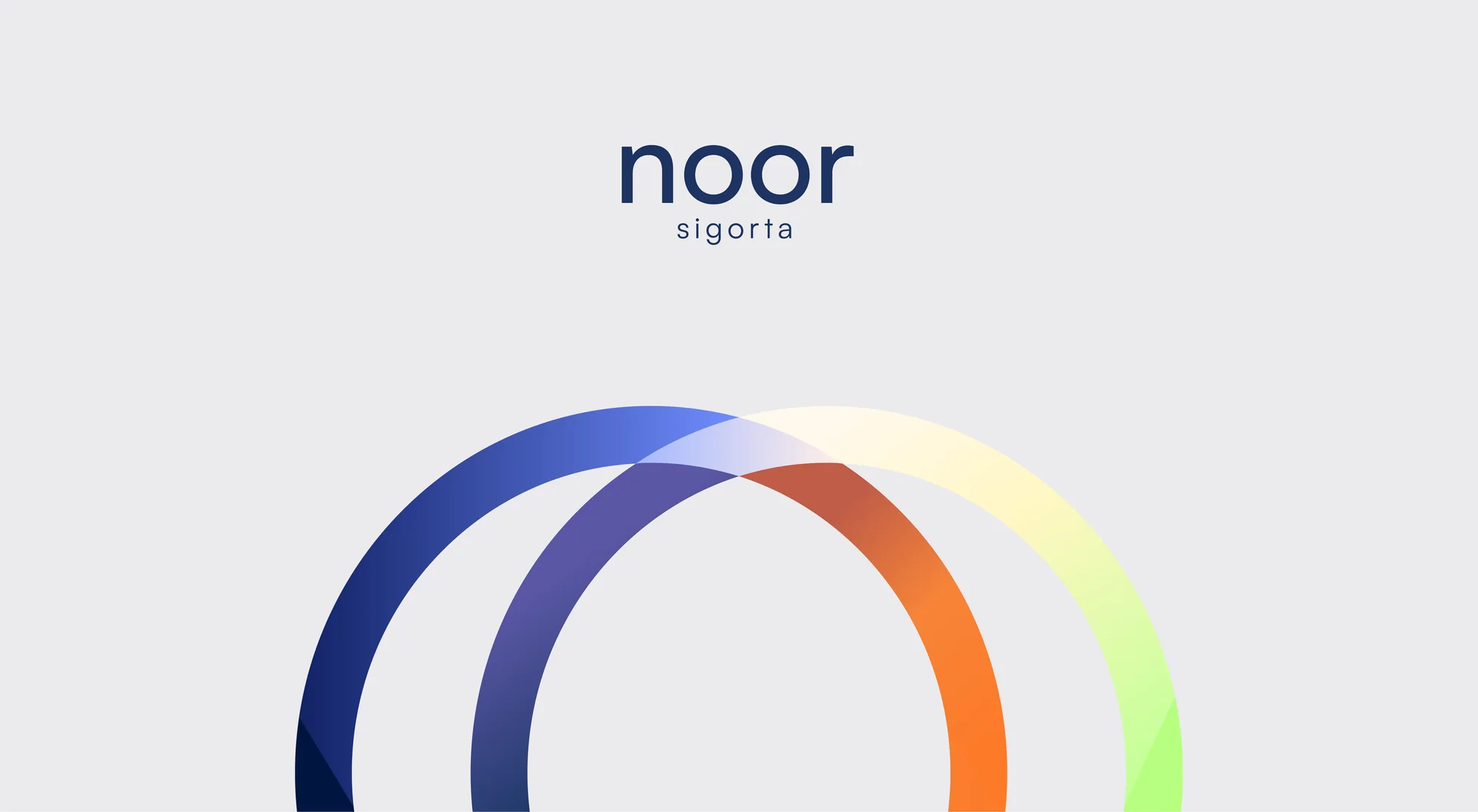
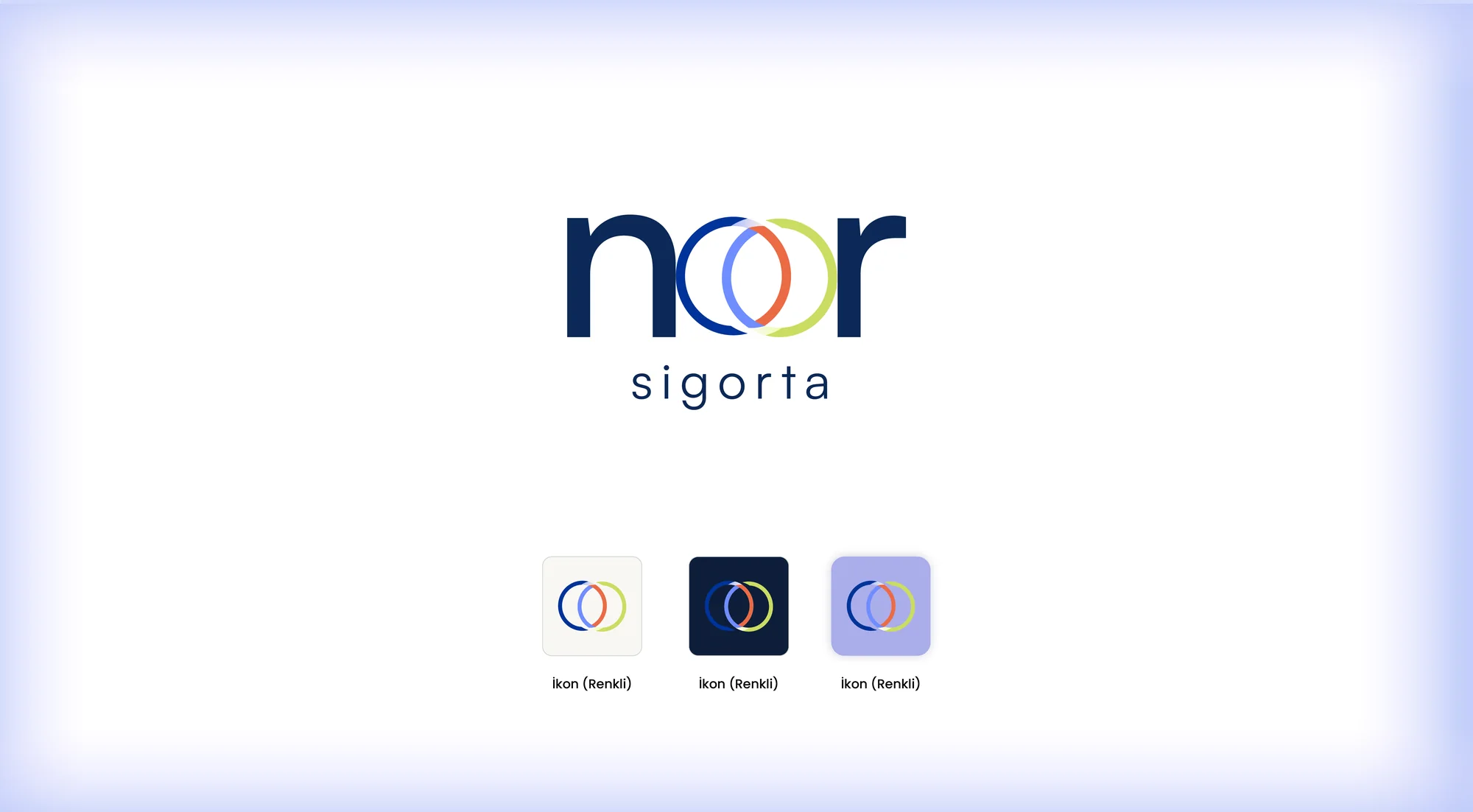
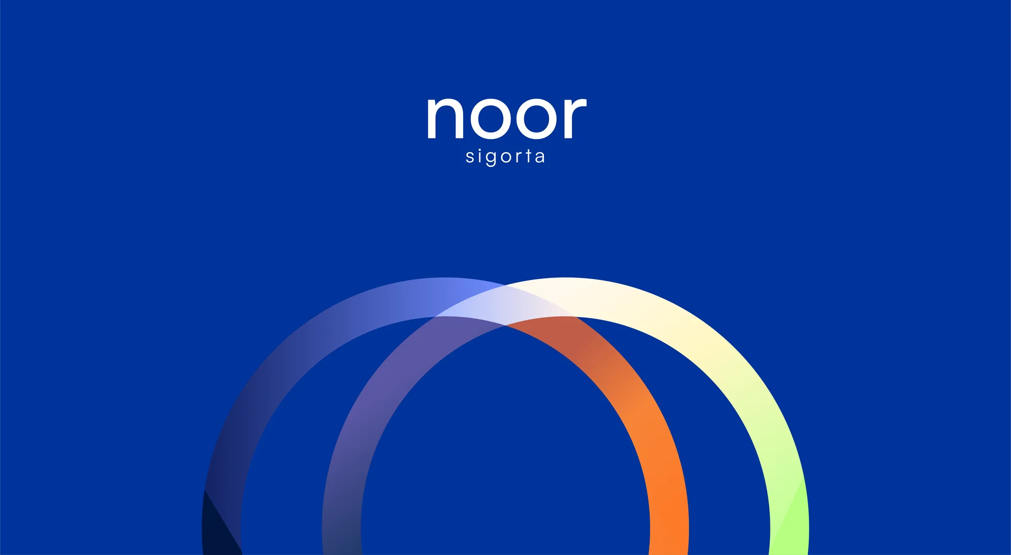
This thinking shaped the next move: turning interlocking circles into a symbol of relationships and lasting trust. The decision was translated into copy principles, reusable layouts, production notes and review criteria. Each output had to make the next action obvious, preserve the character of the brand and remain useful when content changed. We tested the logic against common user questions and realistic production pressure. This made the work more than a polished presentation: it became an operational tool that supported consistent choices, reduced repeated effort and gave the team room to develop new communication without losing the central idea.
04 — Logo system
The next priority was balancing institutional confidence with the accessibility of personal advice. We reviewed the existing material, product reality, audience questions and the moments where information could become unclear. Workshops and content mapping helped the team separate assumptions from evidence. That shared view gave strategy, design and production teams one reference point, so decisions could be explained and repeated rather than depending on personal preference. We also considered how this part of the experience would behave on a small phone, a wide presentation screen, a social post and a live conversation.
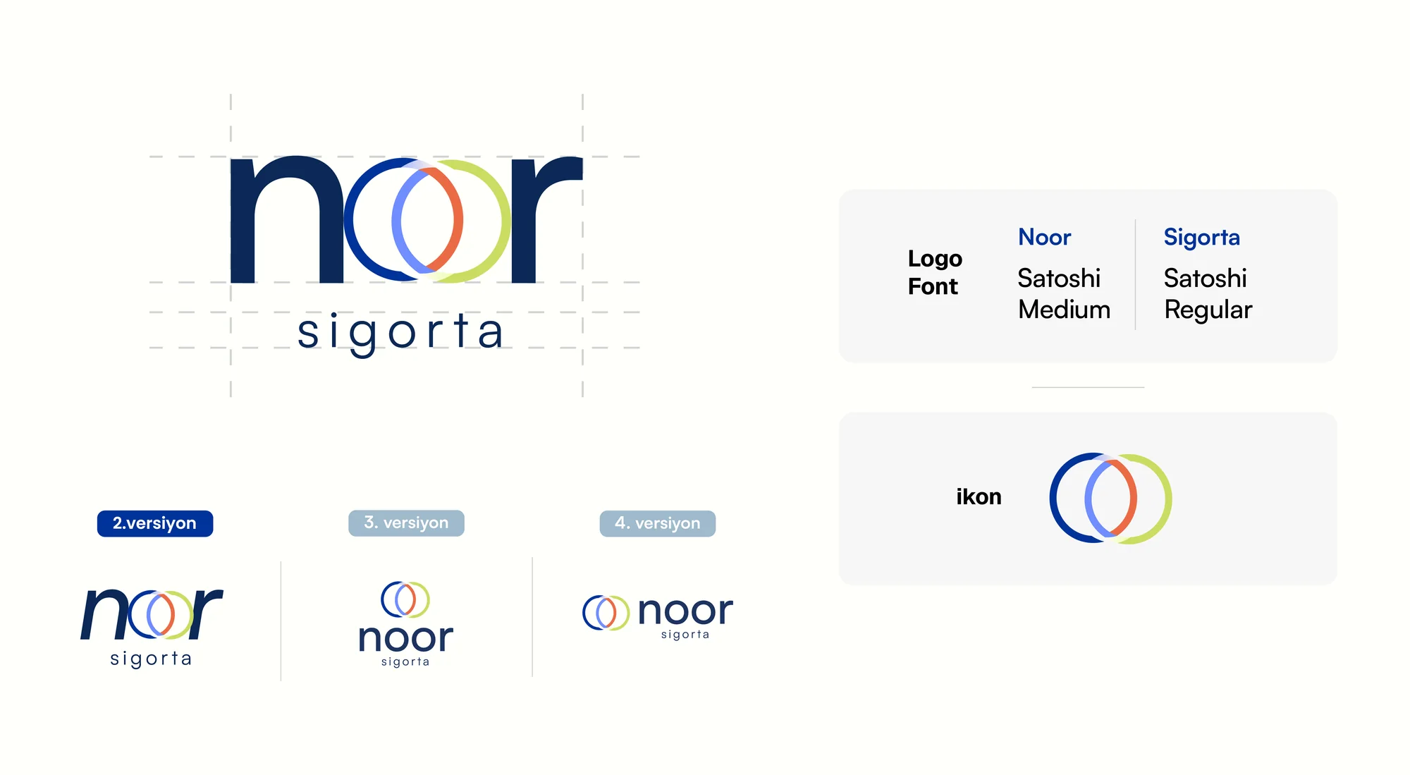
In practice, the response centred on designing the main mark, wordmark and supporting versions for different scales. The decision was translated into copy principles, reusable layouts, production notes and review criteria. Each output had to make the next action obvious, preserve the character of the brand and remain useful when content changed. We tested the logic against common user questions and realistic production pressure. This made the work more than a polished presentation: it became an operational tool that supported consistent choices, reduced repeated effort and gave the team room to develop new communication without losing the central idea.
05 — Colour world
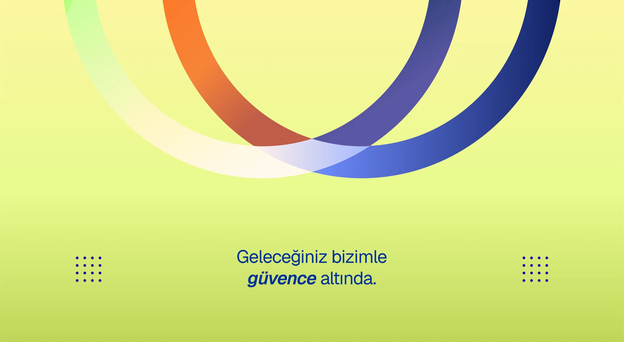
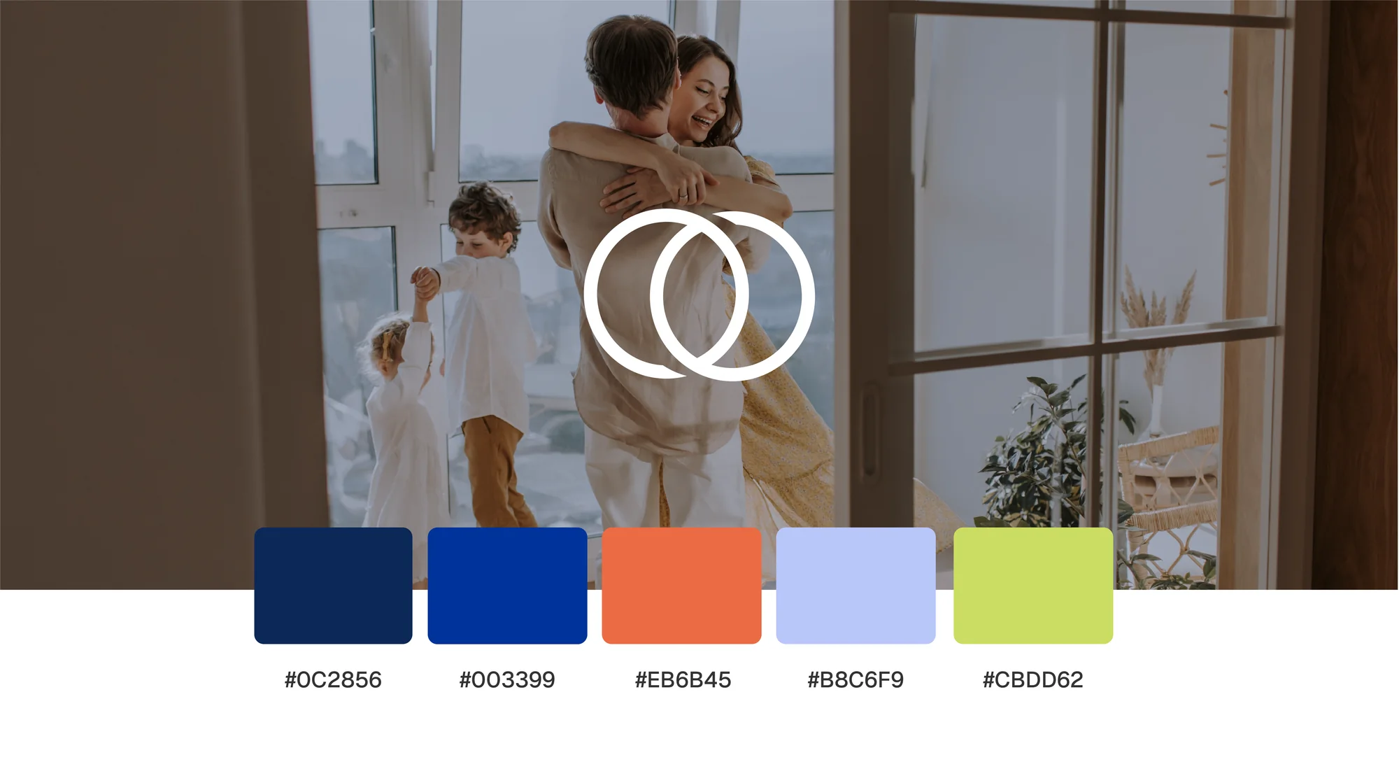
For Colour world, our aim was creating a memorable personality without limiting trust to one dark corporate colour. We reviewed the existing material, product reality, audience questions and the moments where information could become unclear. Workshops and content mapping helped the team separate assumptions from evidence. That shared view gave strategy, design and production teams one reference point, so decisions could be explained and repeated rather than depending on personal preference. We also considered how this part of the experience would behave on a small phone, a wide presentation screen, a social post and a live conversation.
Our chosen approach involved supporting the navy foundation with transitions through orange, purple, blue and lime. The decision was translated into copy principles, reusable layouts, production notes and review criteria. Each output had to make the next action obvious, preserve the character of the brand and remain useful when content changed. We tested the logic against common user questions and realistic production pressure. This made the work more than a polished presentation: it became an operational tool that supported consistent choices, reduced repeated effort and gave the team room to develop new communication without losing the central idea.
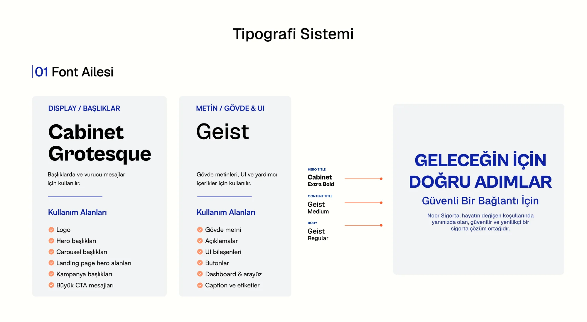
06 — Typography
We began this stage by protecting readability in detailed explanations and confidence in headlines. We reviewed the existing material, product reality, audience questions and the moments where information could become unclear. Workshops and content mapping helped the team separate assumptions from evidence. That shared view gave strategy, design and production teams one reference point, so decisions could be explained and repeated rather than depending on personal preference. We also considered how this part of the experience would behave on a small phone, a wide presentation screen, a social post and a live conversation.
We responded with a clear decision: establishing a clear hierarchy that remained consistent in digital and printed settings. The decision was translated into copy principles, reusable layouts, production notes and review criteria. Each output had to make the next action obvious, preserve the character of the brand and remain useful when content changed. We tested the logic against common user questions and realistic production pressure. This made the work more than a polished presentation: it became an operational tool that supported consistent choices, reduced repeated effort and gave the team room to develop new communication without losing the central idea.
07 — Information architecture
The central question at this point was how to approach helping visitors compare private pension and life insurance options. We reviewed the existing material, product reality, audience questions and the moments where information could become unclear. Workshops and content mapping helped the team separate assumptions from evidence. That shared view gave strategy, design and production teams one reference point, so decisions could be explained and repeated rather than depending on personal preference. We also considered how this part of the experience would behave on a small phone, a wide presentation screen, a social post and a live conversation.
The review clarified our direction: presenting needs, benefits, process and next steps in a predictable order. The decision was translated into copy principles, reusable layouts, production notes and review criteria. Each output had to make the next action obvious, preserve the character of the brand and remain useful when content changed. We tested the logic against common user questions and realistic production pressure. This made the work more than a polished presentation: it became an operational tool that supported consistent choices, reduced repeated effort and gave the team room to develop new communication without losing the central idea.
08 — Website experience
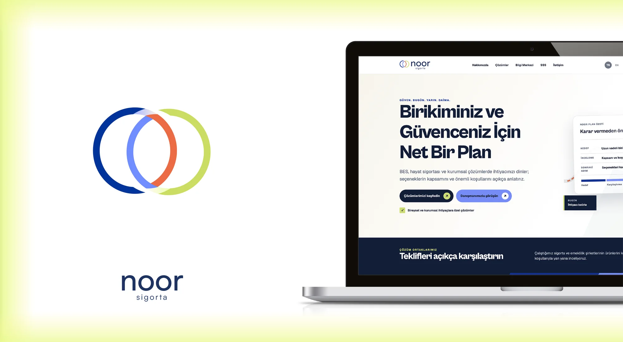
As the work developed, we concentrated on guiding people toward expert advice without exhausting them with terminology. We reviewed the existing material, product reality, audience questions and the moments where information could become unclear. Workshops and content mapping helped the team separate assumptions from evidence. That shared view gave strategy, design and production teams one reference point, so decisions could be explained and repeated rather than depending on personal preference. We also considered how this part of the experience would behave on a small phone, a wide presentation screen, a social post and a live conversation.
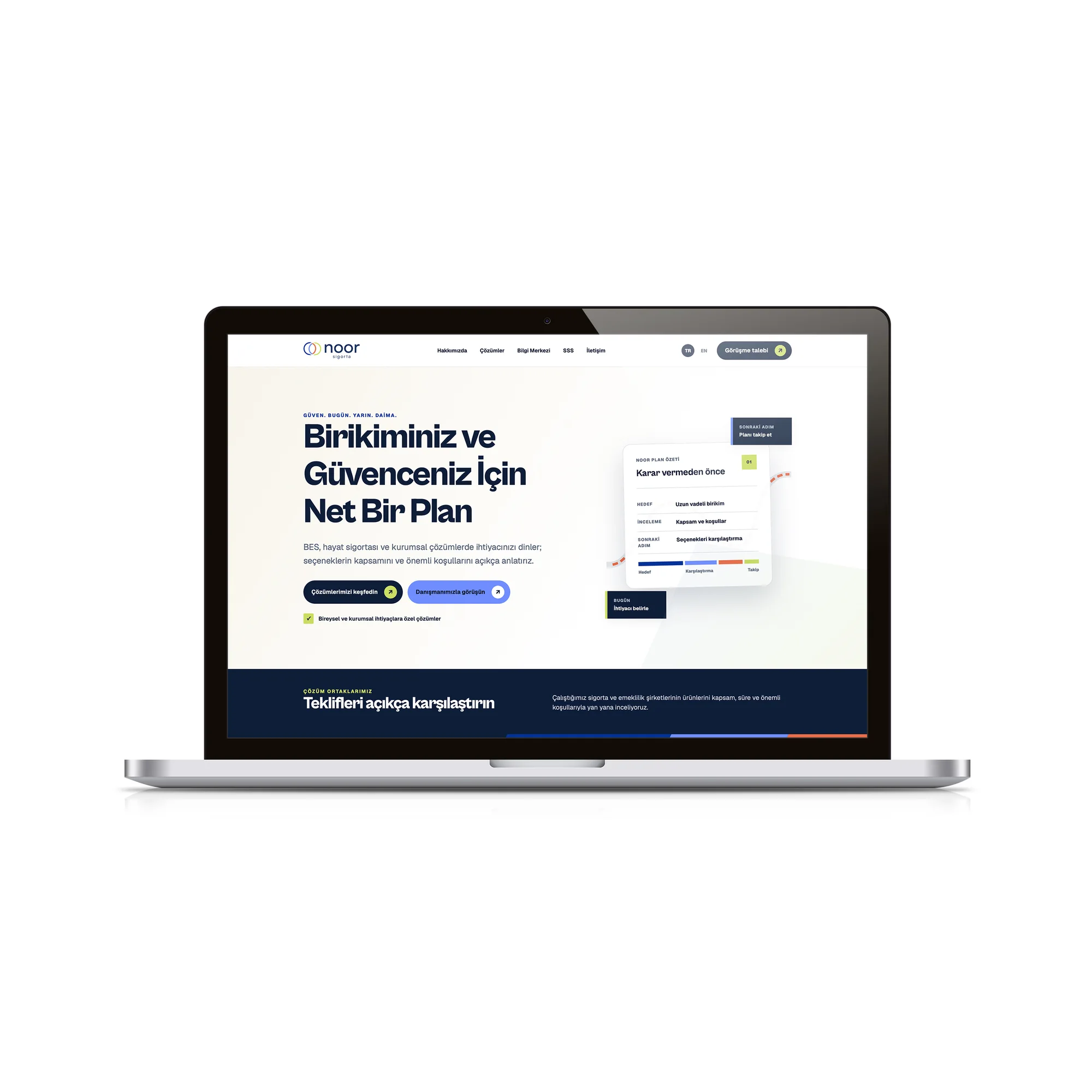
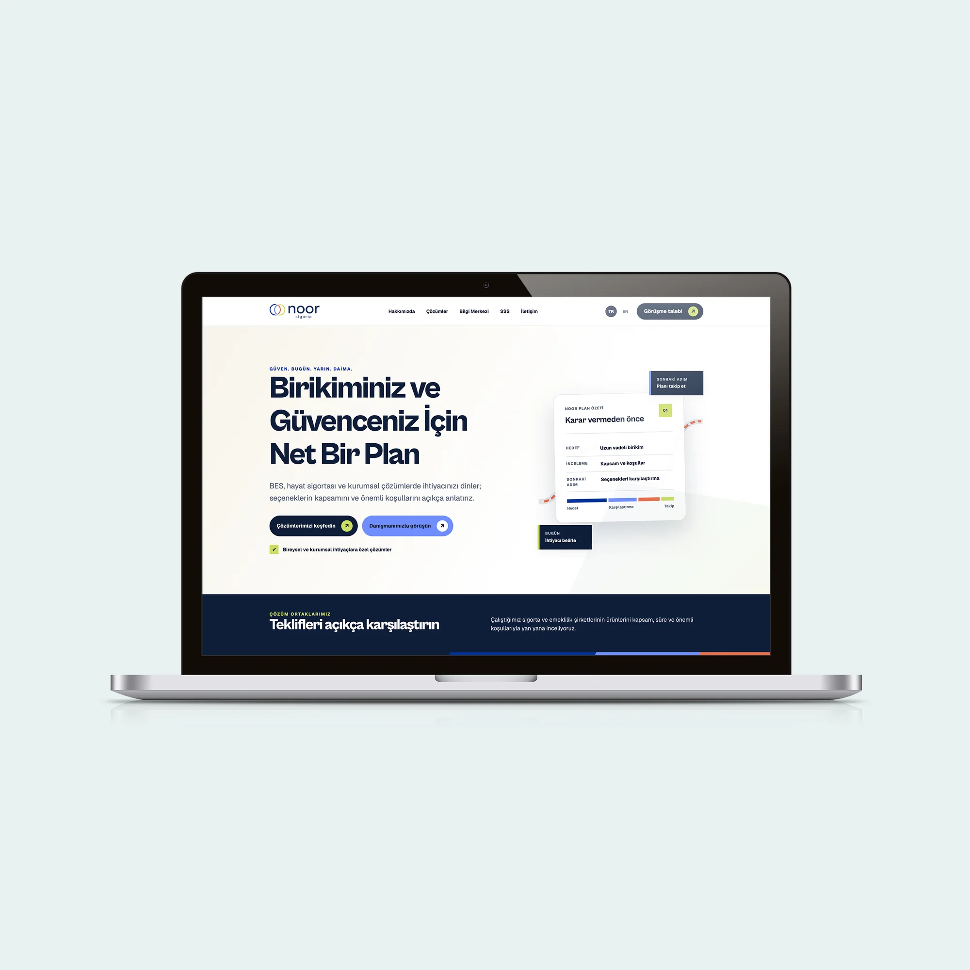
This thinking shaped the next move: designing a smooth journey through concise explanations, visible actions and trust signals. The decision was translated into copy principles, reusable layouts, production notes and review criteria. Each output had to make the next action obvious, preserve the character of the brand and remain useful when content changed. We tested the logic against common user questions and realistic production pressure. This made the work more than a polished presentation: it became an operational tool that supported consistent choices, reduced repeated effort and gave the team room to develop new communication without losing the central idea.
09 — Content voice
The next priority was reducing the distance created by overly formal financial language. We reviewed the existing material, product reality, audience questions and the moments where information could become unclear. Workshops and content mapping helped the team separate assumptions from evidence. That shared view gave strategy, design and production teams one reference point, so decisions could be explained and repeated rather than depending on personal preference. We also considered how this part of the experience would behave on a small phone, a wide presentation screen, a social post and a live conversation.
In practice, the response centred on breaking complex subjects into smaller parts with a clear, respectful and solution-oriented tone. The decision was translated into copy principles, reusable layouts, production notes and review criteria. Each output had to make the next action obvious, preserve the character of the brand and remain useful when content changed. We tested the logic against common user questions and realistic production pressure. This made the work more than a polished presentation: it became an operational tool that supported consistent choices, reduced repeated effort and gave the team room to develop new communication without losing the central idea.
10 — Social system
For Social system, our aim was supporting financial awareness through regular and useful communication. We reviewed the existing material, product reality, audience questions and the moments where information could become unclear. Workshops and content mapping helped the team separate assumptions from evidence. That shared view gave strategy, design and production teams one reference point, so decisions could be explained and repeated rather than depending on personal preference. We also considered how this part of the experience would behave on a small phone, a wide presentation screen, a social post and a live conversation.
Our chosen approach involved combining knowledge, questions, reminders and advisory content in consistent templates. The decision was translated into copy principles, reusable layouts, production notes and review criteria. Each output had to make the next action obvious, preserve the character of the brand and remain useful when content changed. We tested the logic against common user questions and realistic production pressure. This made the work more than a polished presentation: it became an operational tool that supported consistent choices, reduced repeated effort and gave the team room to develop new communication without losing the central idea.
11 — Physical applications
We began this stage by continuing the brand character in offices, presentations and events. We reviewed the existing material, product reality, audience questions and the moments where information could become unclear. Workshops and content mapping helped the team separate assumptions from evidence. That shared view gave strategy, design and production teams one reference point, so decisions could be explained and repeated rather than depending on personal preference. We also considered how this part of the experience would behave on a small phone, a wide presentation screen, a social post and a live conversation.
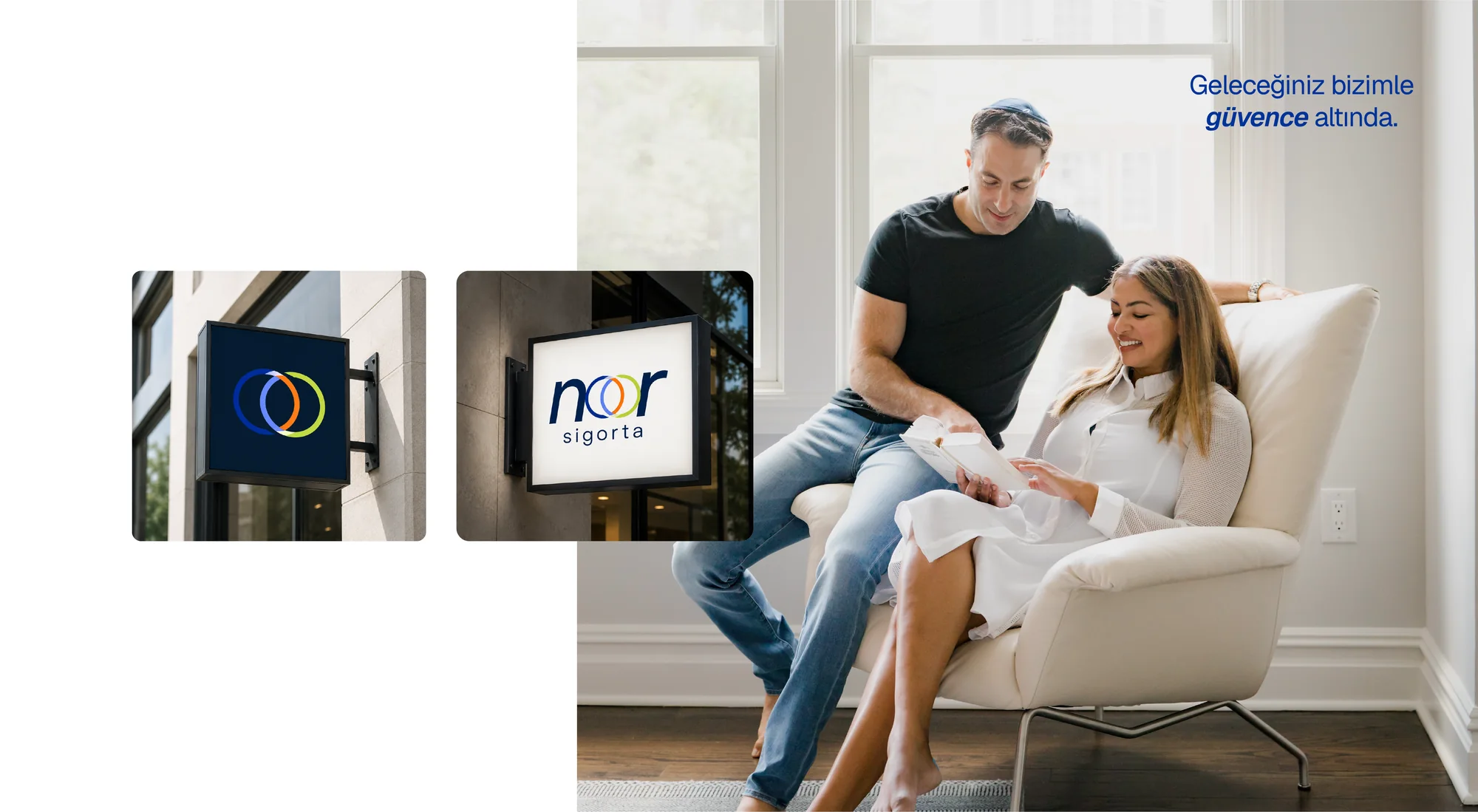
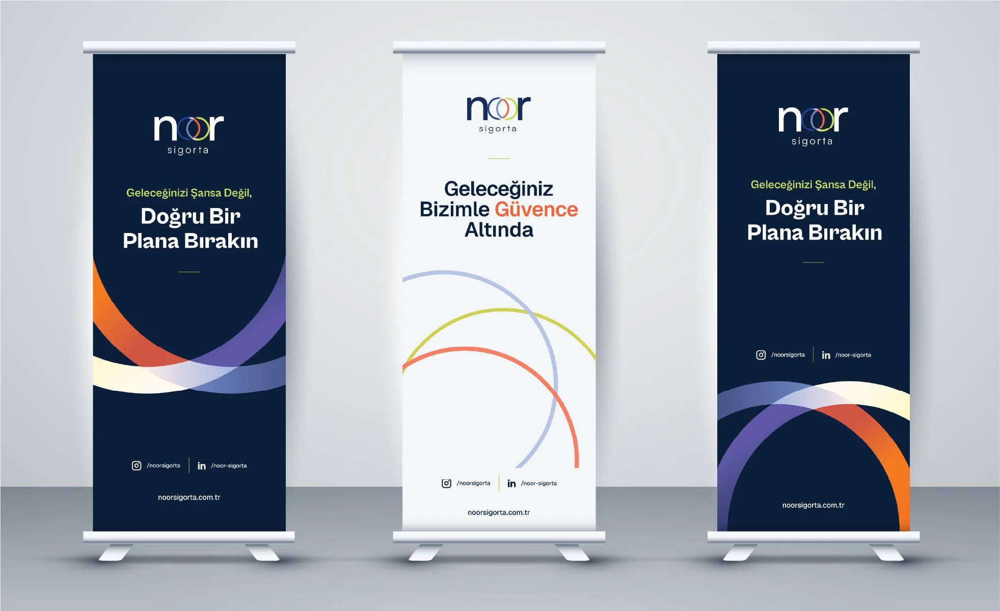
We responded with a clear decision: preparing roll-ups, cards, documents and displays through the same visual principles. The decision was translated into copy principles, reusable layouts, production notes and review criteria. Each output had to make the next action obvious, preserve the character of the brand and remain useful when content changed. We tested the logic against common user questions and realistic production pressure. This made the work more than a polished presentation: it became an operational tool that supported consistent choices, reduced repeated effort and gave the team room to develop new communication without losing the central idea.
12 — Accessibility and trust
The central question at this point was how to approach including users with different ages and levels of digital confidence. We reviewed the existing material, product reality, audience questions and the moments where information could become unclear. Workshops and content mapping helped the team separate assumptions from evidence. That shared view gave strategy, design and production teams one reference point, so decisions could be explained and repeated rather than depending on personal preference. We also considered how this part of the experience would behave on a small phone, a wide presentation screen, a social post and a live conversation.
The review clarified our direction: reducing uncertainty through readable sizes, clear contrast and guiding microcopy. The decision was translated into copy principles, reusable layouts, production notes and review criteria. Each output had to make the next action obvious, preserve the character of the brand and remain useful when content changed. We tested the logic against common user questions and realistic production pressure. This made the work more than a polished presentation: it became an operational tool that supported consistent choices, reduced repeated effort and gave the team room to develop new communication without losing the central idea.
13 — Sustainable structure
As the work developed, we concentrated on protecting consistency when new products and campaigns are introduced. We reviewed the existing material, product reality, audience questions and the moments where information could become unclear. Workshops and content mapping helped the team separate assumptions from evidence. That shared view gave strategy, design and production teams one reference point, so decisions could be explained and repeated rather than depending on personal preference. We also considered how this part of the experience would behave on a small phone, a wide presentation screen, a social post and a live conversation.
This thinking shaped the next move: leaving rules, components and examples that allow internal teams to produce independently. The decision was translated into copy principles, reusable layouts, production notes and review criteria. Each output had to make the next action obvious, preserve the character of the brand and remain useful when content changed. We tested the logic against common user questions and realistic production pressure. This made the work more than a polished presentation: it became an operational tool that supported consistent choices, reduced repeated effort and gave the team room to develop new communication without losing the central idea.
A connected outcome
The world created for Noor Sigorta turned trust from an abstract claim into a practical quality of the user experience. The circles in the identity express relationships and continuity, while the information architecture helps people move according to their needs. Because the website, social content and physical materials share the same vocabulary, the brand remains recognisable at every touchpoint. The result makes financial planning easier to understand, reveals the value of advice and gives the organisation a system designed for growth.
WHAT DID WE NEED TO SOLVE?
Simplify private pension and life insurance services and make Noor Sigorta’s expertise, reliability and advisory approach visible across digital touchpoints.
HOW DID WE BUILD THE SYSTEM?
We designed an information structure that makes the services easy to understand. A trust focused identity, digital content system and user friendly website design work together to guide visitors towards insurance solutions that fit their needs.
MORE THAN DELIVERABLES: A REUSABLE SYSTEM.
THE SYSTEM ACROSS DIFFERENT TOUCHPOINTS.